Di Logo Design
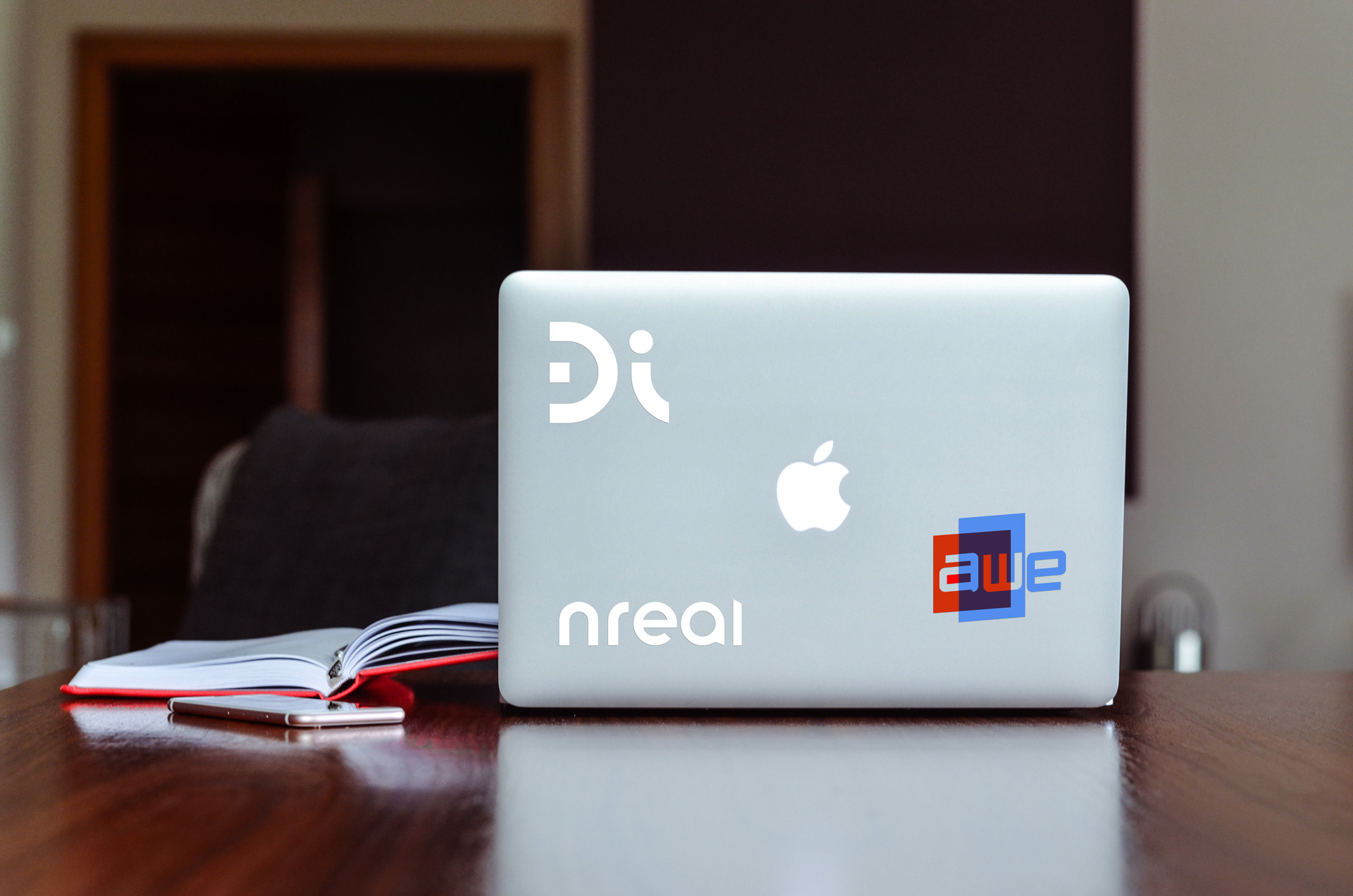
Redesign of Design Interactive's logo and brand style guide.
- Date:2019
- Design, Research, Branding
I started at Di because they were making really cool stuff, especially in the XR space. I quickly came to find out that they were also some really special people to work with as well. Their logo, however, was something unfitting and outdated for this innovative company.
Research
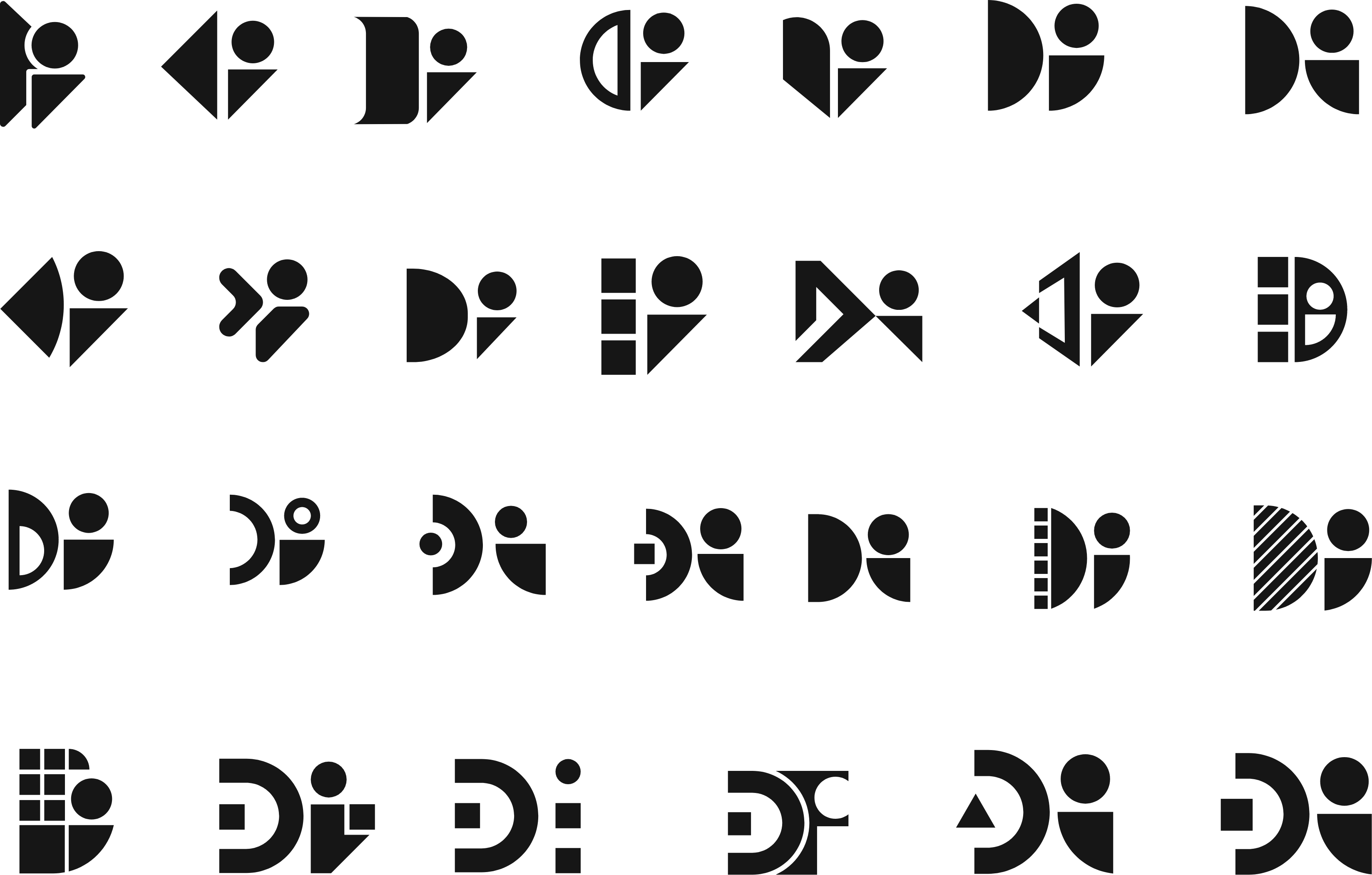
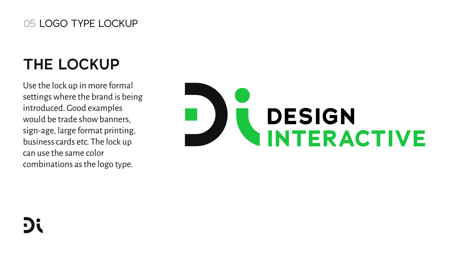
I had to get the backstory on the old logo, how it came about, who made it, and why? I also had to find out whether there was any interest in changing it. I put some feelers out there and pretty much everyone was excited that I had decided to try and redesign it. Upon finding out that the owner of the company was really smitten with modernist design principles, I was happy to research old modernist logos for weeks on end while sketching ideas into a notebook like a mad man. We like to call oursleves "Di" and I found out during this process that people outside the organization and other companies also called us that, so it only made sense to narrow down "Design Interative" to "Di".

